🧑🎨 What is this project about?
As the Smerf community grew faster than anticipated, it was clear we needed to hand the tool kit to our users so that we can empower users to create their own events. With an existing back-end event management tool already in place, my main focus was building a friendlier, user-facing tool so that content creators and large communities can create events of their own! (Spoiler: it was a game-changer!)


Ready, Set, Kickoff! 👟
This kickoff consisted of myself, the dev team, as well as the CTO and my project manager. This meeting began with a discussion of the layout of the preexisting tool the dev team built and then asked ourselves the fundamental question of:
"How can we make this user-friendly?"
During this meeting, we primarily discussed the technical feasibilities of the backend code, limitations and constraints that may need to be considered while building this user-facing tool.
Product Research 📝
Due to time constraints and limited resources, I prioritized product research on companies that create “virtual events”, specifically around gaming. I also researched data analytic platforms and live-service platforms. Then taking these findings I researched further on how we can improvise, imitate, or innovate upon certain features that positively impact usability by conducting a heuristic evaluation.
Key Findings:
Break it down!
A step-by-step process is an easier way for users to digest large blocks of information.
shrink it!
A limited and linear system helps users adapt to new UI. Overwhelming info can dissade users from navigating the tool.
Simplify Terms
Using simpler, straightforward, humanized terminology will carry the entire process and eliminate confusion.
The team collectively decided to utilize the famous React Material UI (MUI) design system to expedite the creation process from designer to developer.


Wireframing 📝
Based on the spacing effect, (where users absorb information better when it's presented in spaced intervals) I designed a section-by-section format with straightforward input fields. This approach ensures a smooth, user-friendly experience where users can easily input information without overthinking where each piece of data should go.
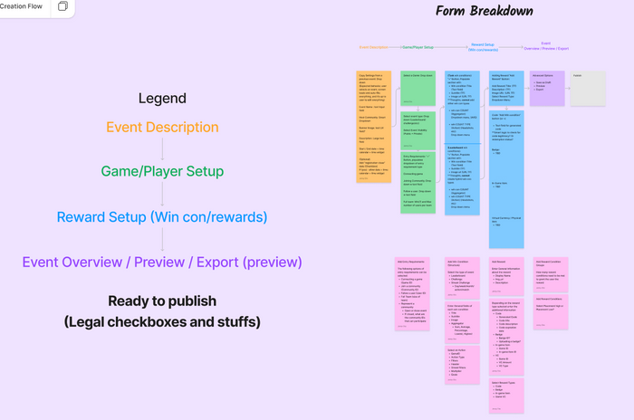
My goal for this phase of the design cycle was to organize the content into collapsible sections, each focused on their own relevant details. For example, game genre, title and description are grouped together, while entry requirements have their own section and win conditions and challenges are in another. This makes the tool a lot more intuitive and keeps related information neatly organized for the user.
Additionally, I designed the option to run the event as a “test” mode, create a “private” or “open” event, as well as a live metric-tracking feature, where hosts can track the participant’s activity and engagement.
Other nuanced features include a duplicating system and transferring administrative privileges to specific users by sending them an invitation to the event management tool.


Each section of the form boxed into separate variants.

Full tool with all the sections stacked together.
User Testing & Validation ✏️
After some user testing, it became clear that the ‘create a challenge’ section was the most time-consuming for users. Over half of them struggled with navigating this part, and their feedback was related to the tool involving so many components to build a complete challenge.
Among 20 participants:
16
Testers
Took the longest time navigating the "win condition" section, and found the most difficulty creating a challenge for an event.
I took a step back and brainstormed solutions, asking the critical question: ‘How can I simplify this complex format?’
How might we
Simplify the UI without compromising the User's Experience?
Reorganize the form for a seamless process?
✨ Iteration & Refinement ✨
It turns out that it wasn't the UI layout that caused navigational confusion, but rather the lack of context.
This iteration primarily focused on adding contextual data, and reorganizing sections to an onboarding style format; a process that is more familiar to the user, which also doubles as a barrier for any potential errors.
I streamlined the structure from over 20 different options down to just 3 modes. I also simplified some terminology to make it easier for users to navigate, and also added helpful tooltips and annotations for extra clarification. In consideration of those who want to create a challenge outside the standard settings, I added an option to request a custom event tailored to their preferences through our support team.
Other iterations include convenient features for communities hosting a large scale of events at a time.
These features include the following:
1. Simplified UI for "newbies"
This is a quick and easy click-through event creation walk-through that guides newbies through their first experience.
2. Quick-view slide out
A convenient slide-out ui that displays the published (or draft) event in a condensed view-mode
3. Live analytic & metric page
This allows large communities to measure interaction and activity in events at large scales, which can be later exported as a pdf file for further analysis.
And finally.. the moment we've all been waiting for...
The Final Result
✨ 1. Onboarding ✨
✨2. Event List & Grid View ✨
✨ 3. Event Form (Manual Data Entry) ✨
✨ 4. Challenge (Task) Creation Flow✨
✨ 5. Adding Challenge Add-ons (Filters)✨
✨6. Adding Rewards✨
Conclusion
This project not only delivered a functional project but also offered a valuable learning experience. Collaborating closely with the dev team allowed us to overcome challenges together, refine the tool’s design, and create a user-friendly solution. It was a rewarding process that strengthened both our teamwork and my understanding of technical and design constraints.
Thanks for making it this far!
Please feel free to email me to learn more about my thought process of this case study. Thank you.


%201.png)


