
Role: UI Designer
Tools: Figma, Adobe Photoshop
Timeline: 1-week UI design sprint
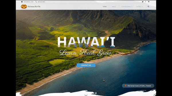
Ho'omau Ke Ola's Landing Page
UI Design Sprint
Brief
What is Ho'omau Ke Ola?
Ho’omau Ke Ola is a non-profit organization to promote healing from Substance Abuse in a trauma-informed environment that weaves Western Best Practices with Hawaiian Spiritual Values.
Day 1–2: Discovery & Research
Research in UI Design? What’s the point?
In order to execute the organization’s vision, I began to contextualize the relevant data.
“What‘s their mission statement?” (Business Goal)
“Who are their users?” (Empathy)
Contextualization allowed me to define the desired outcome from both the business and the user. [Design Thinking]
On Catch-a-Fire, Director Shauna G. proposed a brand new website for her non-profit organization. Upon research, the existing webpage seemed underdeveloped and extremely wordy. This ultimately highlighted the question, “How might the designer bring forth a visual balance to a very informative and formal website?”

Understanding the structure
What's the original site like?
I screenshot each page and took some notes on how might I effectively consolidate jumbled information. This allowed me to visualize proper placements of certain sections and components. (“Can this be included on the homepage?”)
Day 3: Moodboard/Inspirations + Sketching
I went onto Collectui.com to gather some inspiration on some visually appealing designs and created a Moodboard:

Day 3.5: Sketching!
The designing STARTS NOW!
Then I listed some sections that were imperative to the Landing page from top to bottom. This allowed me to maintain the skeleton of the information architecture and hierarchy.
Condensed Nav Bar
Hero Image + CTA
Mission Statement / About
4 Main Programs
After Care
Blog or Media OR Testimonial
Footer

Day 4: Wireframing Mid-Fidelity Prototype
Created with Figma
Creating the wireframe was fairly easy, as my main focus was mainly on the flow of the landing page rather than the structure.
To create this I utilized free-to-use templates on Figma’s Community Plugin option.

Day 5–7 Critique and Iterations
Spoiler Alert: I've had GREAT feedback
On this day I received some valuable feedback on how to better demonstrate the organization’s formality and message… as well as some aesthetic tweaks that needed to be changed.
Here are some valuable comments received by peers:
“Navigation seemed a little too congested, consider increasing the grid layout to spread out the links.”
“The Hero image is hard to see, perhaps adding more contrast to the background will help?”
“The call-to-action button needs to be in context.”
“The green dividers break the flow of the page.”
“The footer should be condensed, it seems too wordy.”
Some critiques also questioned the mission of the website and how the quote “Learn. Heal. Grow” tied into the story from start to finish.
 |  |
|---|
Some visible changes
Updates: Content control
Title: Added spacing in between the content for more breathing room.
Programs: Seemed too wordy, add some context in relation to each program.
Learn More: Changed the wording.
Hey, you made it!
Thanks for reading. Have any questions? Let's connect!